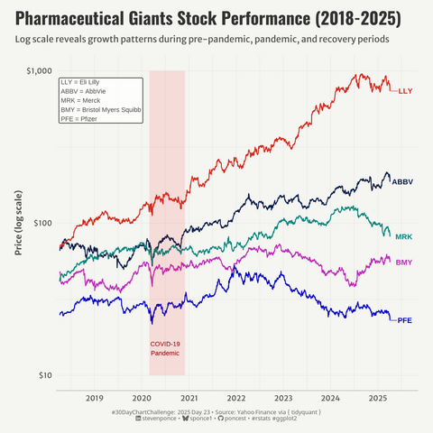
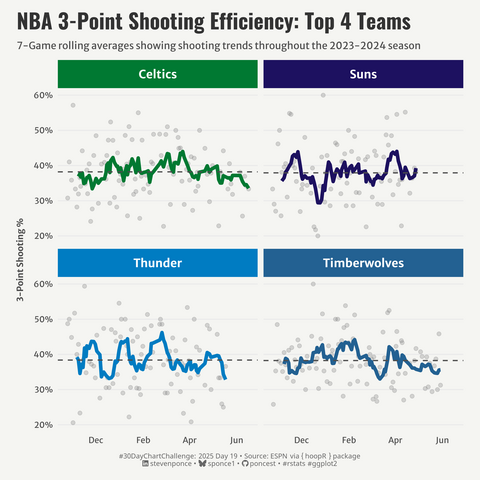
2025 #30DayChartChallenge | day 23 | timeseries | log scale
.: https://stevenponce.netlify.app/data_visualizations/30DayChartChallenge/2025/30dcc_2025_23.html
.
#rstats | #r4ds | #dataviz | #ggplot2
Recent searches
Search options
#30DayChartChallenge
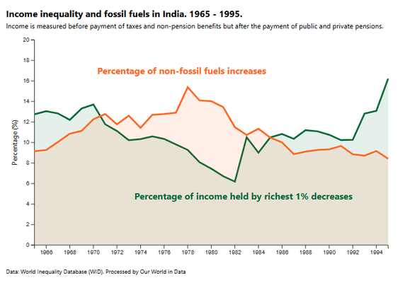
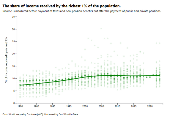
I'm almost back on track with the #30DayChartChallenge with another trio of plots - this time all made from scratch in D3!
I learned how to: Make scatter plots, line charts, and area charts
Highlight and annotate specific data points
Fit Loess curves in D3
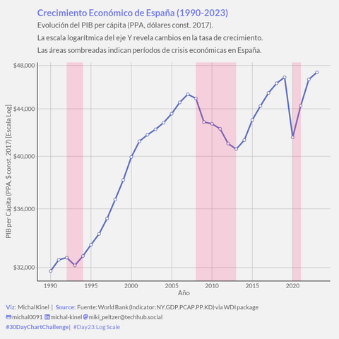
#30DayChartChallenge Día 23: ¡El poder de la Escala Logarítmica! Hoy vemos el PIB per cápita de España
(1990-2023, PPA $const) de otra manera. #TimeseriesWeek #SocialData
¿La clave? scale_y_log10(). En esta escala, la *pendiente* de la línea azul representa la tasa de crecimiento porcentual. ¡Ideal para comparar el ritmo económico a lo largo del tiempo!
Se ven clarísimas las diferentes fases:
* Crecimiento fuerte pre-2008.
* El largo estancamiento post-Gran Recesión (zona rosa 08-13).
* El bache del COVID (zona rosa 20-21).
* La crisis de los 90 (zona rosa 92-94).
Una herramienta básica pero potente del análisis de series temporales económicas.
#rstats #ggplot2 #WDI | Data: World Bank | Theme: #theme_week4_social
Código/Viz: https://t.ly/e3_cv
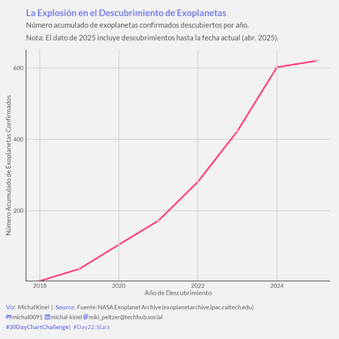
#30DayChartChallenge Día 22: Stars! Planetas, planetas por todas partes!
Gráfico del nº acumulado de exoplanetas confirmados (NASA Exoplanet Archive). #TimeseriesWeek #Astronomy
La curva muestra la explosión de descubrimientos desde los 90, ¡especialmente con Kepler & TESS! Ya superamos los miles de mundos conocidos.
*(Aclaración: El último punto de 2025 es el acumulado hasta hoy, 22 de Abril, no el año completo).*
Impresionante cómo avanza la ciencia que estudia los planetas de otras estrellas.
#rstats #ggplot2 | Data: NASA Exoplanet Archive | Theme: #theme_week4_social
Código: https://t.ly/bCzwJ
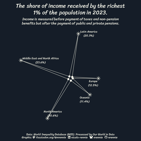
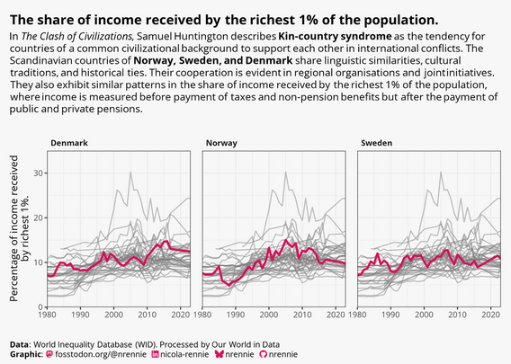
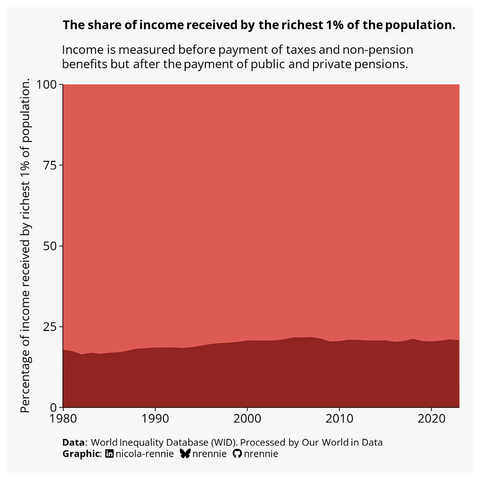
For Day 22 of the #30DayChartChallenge and the prompt of "Stars", I found it quite tricky to make the income inequality data I've been working with fit the prompt.
Is it a radar chart?
Is it a star?
Is it a constellation?
I don't know whether I love it or hate it , but either way it's made with #RStats! For reference, the inner 'stars' represent 1%.
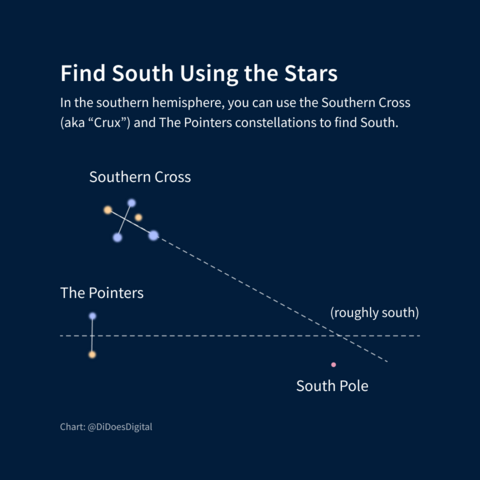
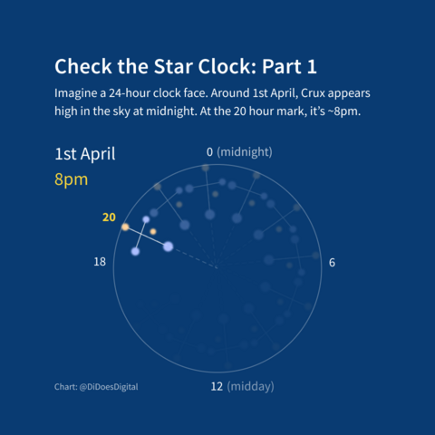
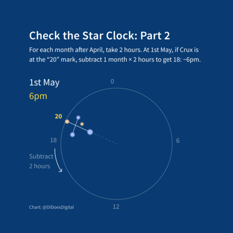
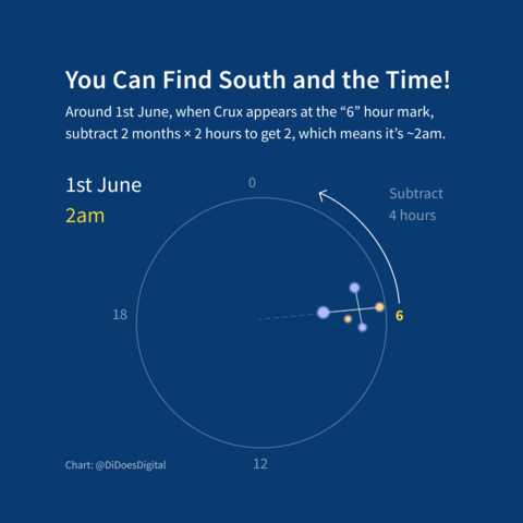
Down under, you can use the Southern Cross to tell time and direction.
Aboriginal Australians are among the world's first astronomers. The southern cross forms part of the Emu in the Sky, a dark constellation, which has featured in storytelling for thousands of years.
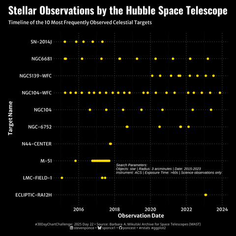
2025 #30DayChartChallenge | day 22 | timeseries | stars
.: https://stevenponce.netlify.app/data_visualizations/30DayChartChallenge/2025/30dcc_2025_22.html
.
#rstats | #r4ds | #dataviz | #ggplot2
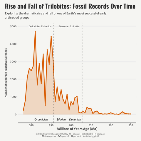
2025 #30DayChartChallenge | day 21 | timeseries | fossils
.: https://stevenponce.netlify.app/data_visualizations/30DayChartChallenge/2025/30dcc_2025_21.html
.
#rstats | #r4ds | #dataviz | #ggplot2
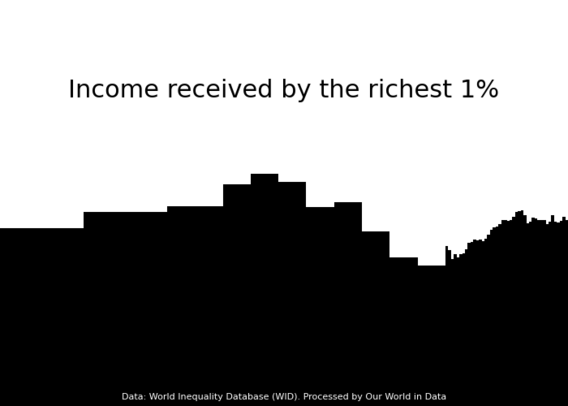
For Day 20 of the #30DayChartChallenge and the prompt of "Urbanization", I used #Python to make a very abstract plot in the style of a city skyline silhouette!
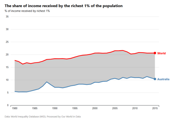
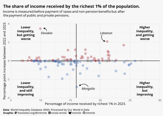
(Still using the income inequality data via Our World in Data)
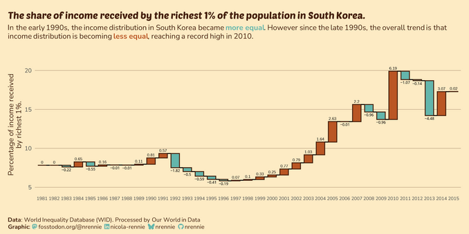
Catching up on Day 16 of the #30DayChartChallenge with the prompt of "Negative"!
Waterfall chart made in #RStats
Doesn't feel as intuitive when decreases are a positive outcome
Needed a few hacky approaches to get the right layout
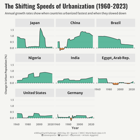
2025 #30DayChartChallenge | day 20 | timeseries | urbanization
.: https://stevenponce.netlify.app/data_visualizations/30DayChartChallenge/2025/30dcc_2025_20.html
.
#rstats | #r4ds | #dataviz | #ggplot2
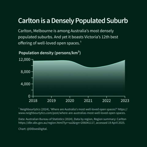
One thing I enjoy about this social media chart challenge is that I can sneak in silly choices I wouldn't usually make.
Behold my gradient, lack of data point circles, and use of curvy lines!
I also don't have to spend time making it work at a bajillion screen sizes and ratios.
2025 #30DayChartChallenge | day 19 | timeseries | smooth
.: https://stevenponce.netlify.app/data_visualizations/30DayChartChallenge/2025/30dcc_2025_19.html
.
#rstats | #r4ds | #dataviz | #ggplot2
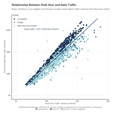
2025 #30DayChartChallenge | day 18 | relationships | el pais (theme)
.: https://stevenponce.netlify.app/data_visualizations/30DayChartChallenge/2025/30dcc_2025_18.html
.
#rstats | #r4ds | #dataviz | #ggplot2
I'm a little bit behind on posting my #30DayChartChallenge plots - so here's Day 15 for the prompt of "Complicated"
Inverted the prompt and made an uncomplicated plot!
Trying the new #tidyplots package in #RStats
Appreciate the naturally clean chart aesthetics
Still works nicely with #ggplot2 extensions
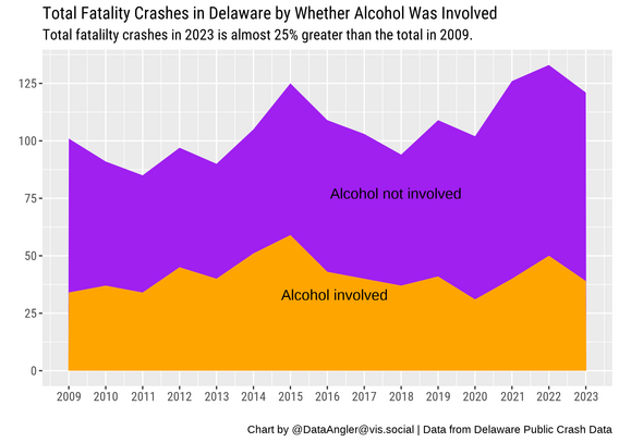
For day 2 of #30DayChartChallenge, I made an area chart in #rstats to show the increase in automobile crashes in Delaware (and the proportion in which alcohol was involved). It might be a stretch to call it a slope chart. :) #dataviz
Code: https://github.com/bardolater/30DayChartChallenge/blob/main/2025/02_Slope.r
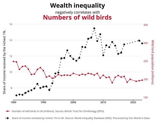
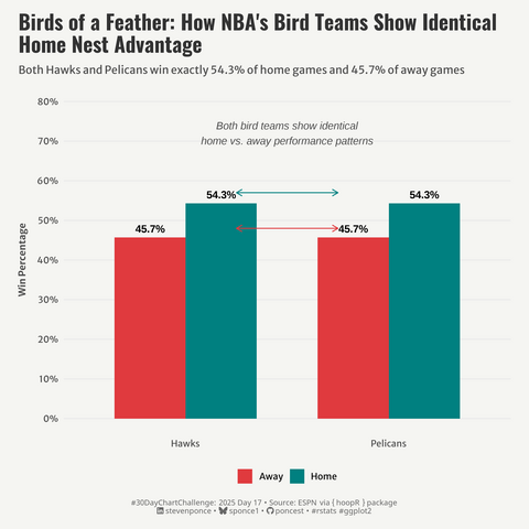
When I decided to visualise the same dataset on income inequality for all 30 prompts of the #30DayChartChallenge, I wasn't sure how I'd manage to make the prompt of "Birds" fit with that data... But I managed to shoehorn some data about birds in there!
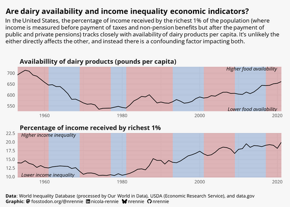
The result? A "correlation is not causation" / "dual axes are bad" plot in the style of Spurious Correlations made with #RStats!
2025 #30DayChartChallenge | day 17 | relationships | birds
.: https://stevenponce.netlify.app/data_visualizations/30DayChartChallenge/2025/30dcc_2025_17.html
.
#rstats | #r4ds | #dataviz | #ggplot2
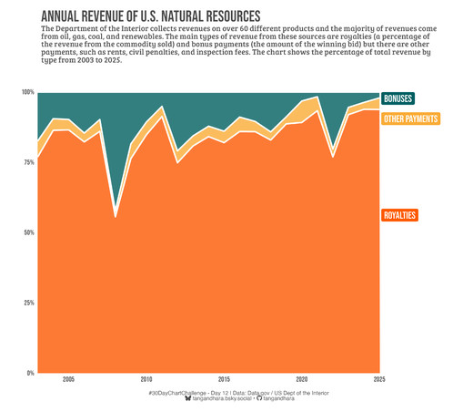
#30DayChartChallenge - Day 12: data.gov data day Still playing catch up but here's a new one chart: the proportion of revenue the Dept of the Interior has made since 2003 from bonuses and royalties on leases of its natural resources. #rstats #dataviz


